
Overview
Clover wanted to improve the purchase journey by giving business owners more guidance and more freedom to choose the right combination of features and point-of-sale devices for their business. I led content design from concepts through to launch, working closely with product design, research, product, and engineering to ideate, test, refine, and QA the experience.
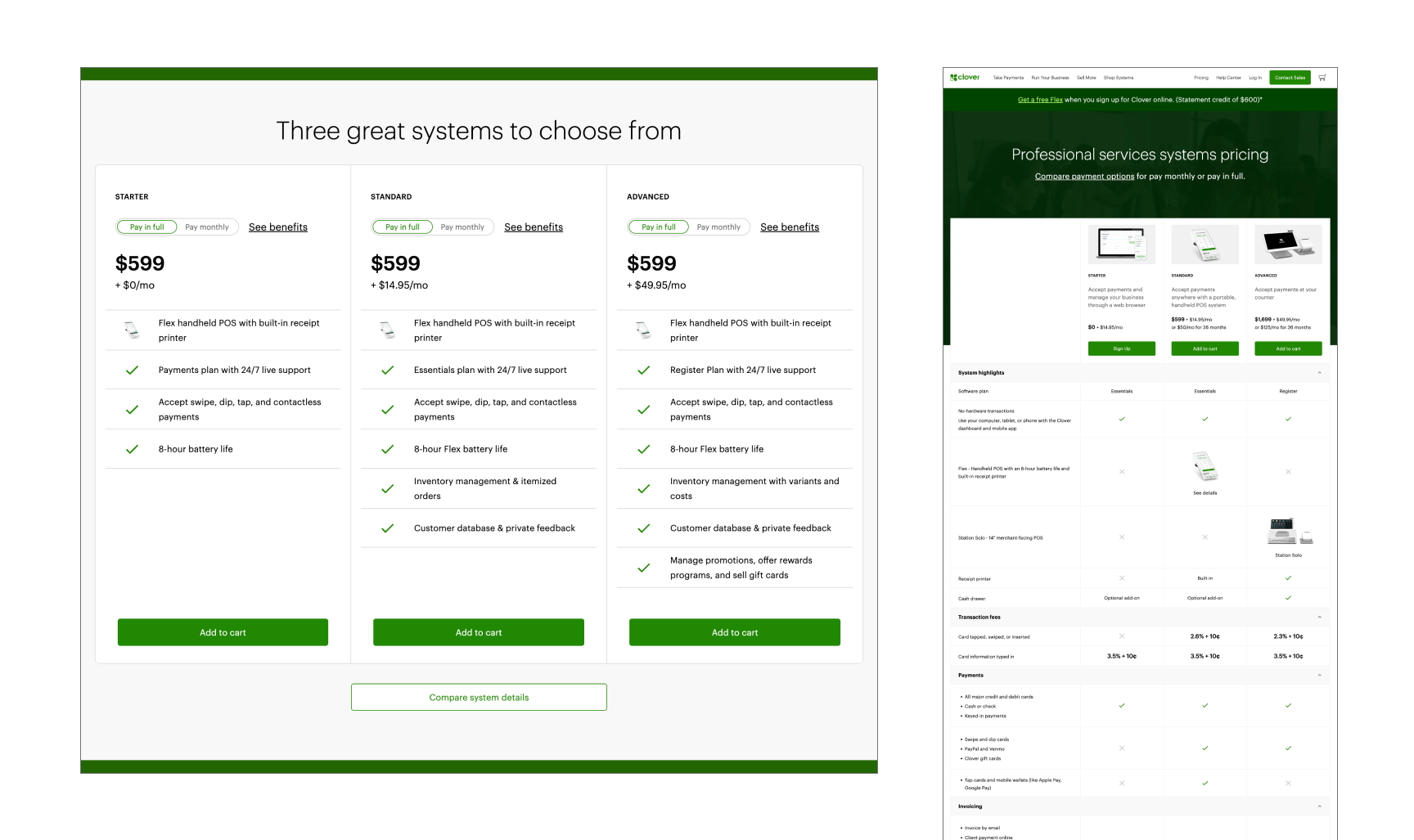
Clover.com previously offered a limited set of bundles
Concepts
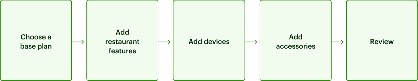
We set out to design a flow in which merchants could build a custom Clover system with their preferred mix of hardware, plan, and accessories. We went mobile-first because more than half of prospective merchants navigate to Clover.com on their phones. Our proposed flow broke plan selection into two steps, positioning our restaurant plans as add-ons to the other plans that were not vertical-specific.
I worked with my product design partners to explore UI and how to describe and frame each plan's benefits. I avoided leading with the plan names because they are not descriptive (i.e. Payments, Essentials, Register). I tried being explicit that features were additive, recommending based on business type, and playing with voice. It was a tricky copy task but the UI and copy evolved together and we ended up with something that felt balanced and scannable.
Research
I took part in a research question generation session and made sure to include questions about content in the interview protocol. Our UX researcher showed the following prototype in 30-min interviews with a diverse group of business owners.
Here is what we tested:

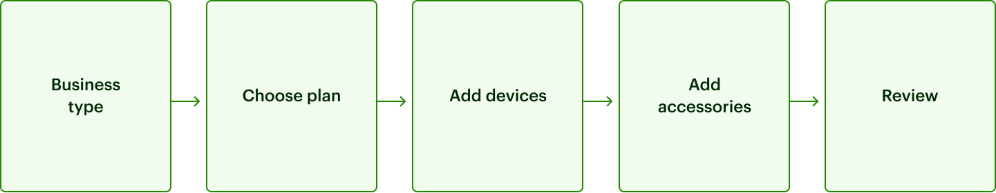
Final flow with branching based on business type selection. Relevant plans are for each business type.
We did some refinement of the UI, and added the plan names as eyebrow text so that they’d be listed properly in the user’s cart at the end of the flow. We applied the same treatment to the accessories page, so that all screens contain the same cadence of info: eyebrow, title, description, and accordion with more details. We ultimately reduced the number of features listed under each plan because the containers were getting really long. I worked closely with product marketing to fact-check the content in every element, and QA’ed every screen.
Outcomes
Here's the final flow for a restaurant business.
The experience boosted our acquisition numbers, most notably in average cart value, which increased by 9x. Users were on average seven times more likely to convert after going through the system builder than had they added a preset bundle to their cart.
We noticed more users were using desktop than expected, so we set about optimizing the design for desktop. I led an impact/effort matrix exercise on next steps in which I gathered up the items on our wishlist of small improvements, plus the nice-to-haves that didn’t make it into the v1, and other suggestions that had emerged post-launch. After sorting the list together, we saw that many fit into the low effort/high impact quadrant, and updates got underway.
