
Role: Copywriter
Agency: Donovan Green
Intercept Pharmaceuticals was studying an investigational medication for nonalcoholic steatohepatitis (NASH), a liver disease on the rise, and mounting a full campaign to recruit participants. I wrote multiple pieces of patient-facing collateral for the study, titled REGENERATE, and throughout my engagement stayed attentive to the audience’s knowledge of medical terms, and the context in which they’d encounter each of the materials.
A challenge of this particular recruitment campaign was creating awareness and education about the disease. It has become the second leading cause for liver transplants, yet many people have never heard of it. Heavy alcohol consumption does not play into its development, which is a common assumption when it comes to liver disease, so people who are not heavy drinkers but have NASH risk factors often have no idea that their livers are degrading until they’re at the point of needing a transplant. I had to pack a lot of info in that people would have to process before even considering participating in the study.
My first task was to organize and write the brochure that people would encounter in a doctor’s office, either in the waiting room or through their doctor handing it to them. I was given some talking points and preliminary language to work with, and from there began to take stock of everything I had to touch on and figure out how it could all fit within the bounds of a standard trifold. Items to cover:
How NASH manifests, its seriousness and its risk factors
How NASH is diagnosed and current lack of treatment options
The REGENERATE study’s aim, and what it would test
Time commitment for participants, basic study structure, and eligibility requirements
Call to action: ask your doctor if you could have NASH, and if so, whether REGENERATE might be for you
I determined the cadence of the brochure content, deciding what was the most important information to see upon opening it, and how that “story” would flow once someone sees the full inner spread. Making a content outline within a trifold template helped to gauge what was possible with such limited real estate. It was an education piece as well as a promotional piece, so I balanced those aspects equally.
We had a lot of back and forth with the client on accessible language for patients. I made calls on limiting the introduction of terms that could be new to a patient, and used the simplest language possible to define terms we chose to introduce. For example, I opted to mention the word “fibrosis” in a parenthetical, but primarily used “liver scarring” to make it easier to understand how NASH works. I explained that the trial is double-blind without using the word. There are a lot of terms in the list of what disqualifies people from study participation (such as “cirrhosis” and “ileal resection”), but they were not necessary to define, as only people who had those conditions—and would know what they mean—needed to pay attention to that content. Throughout, I questioned what people needed to know right then to take the desired course of action, and what was extraneous or potentially confusing language or information that could impede that.
Here is the outside and inside spread of the brochure.


The brochure was a sort of hub that everything else branched out from, as it encompassed all the messaging around REGENERATE in condensed form. It contained all the key terms that needed to be approved by regulatory committees, so as it went through reviews and wording fluctuated—“investigational drug” became ”investigational medication”, “doctor” or “healthcare provider” replaced “physician”—I updated all other materials accordingly.
The brochure is where I began to set some style guidelines for all the REGENERATE recruitment collateral, such as whether to place REGENERATE in all caps (the answer is yes, in case that wasn’t clear), and I initiated and continuously updated a style and language guide, which you can see excerpts of below.
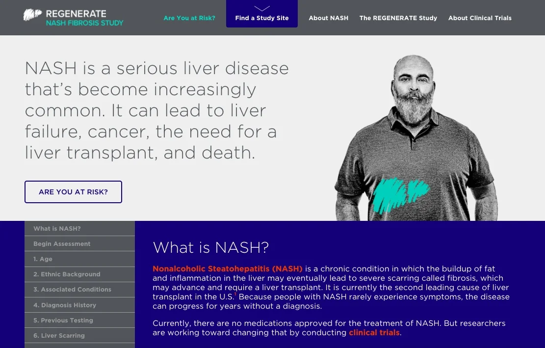
All the print materials drove people to speak to their doctors, as well as visit the study website. That meant people arriving at the site already had some interest in NASH and REGENERATE, so the language there could be a bit more advanced and detailed.
Below is an excerpt of the homepage, followed by an excerpt of the About Clinical Trials page.

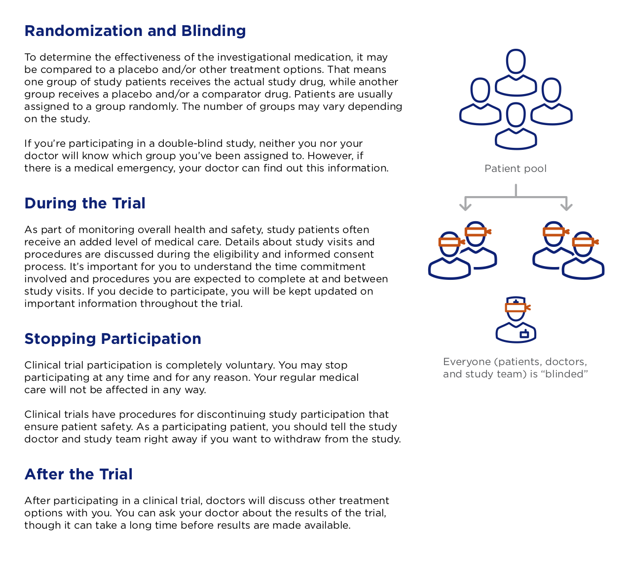
Interested parties could go even deeper into education on NASH, REGENERATE, and general clinical trial procedures by requesting 4-6 page guides on each topic. I came in when there were already drafts of each of these, at different levels of fidelity. I both polished and rewrote, again simplifying the language as much as possible for the audience. This is a page from the guide detailing how clinical trials work.
I proofread all materials multiple times, including other collateral in progress that I didn’t write. The style guide I created kept track of everything from new regulatory directives to acronyms and first mentions, and proved essential as I checked for consistency of language across half a dozen touchpoints. It calls for AP style when spelling out numbers, Chicago style for serial commas, and gets granular on styling of certain words. I’ll leave you with some samples from this thrilling document.
“Study name
• “REGENERATE” is always in all caps
• Capitalize “the” and “study” only in headlines
• In a sentence, do not capitalize either “the” or “study” (unless “the” is the first word of the sentence)
• Say “the REGENERATE study” instead of “the REGENERATE NASH study”
• Once the study has been introduced as “the REGENERATE study”, it’s OK to refer to it later on that page as simply “REGENERATE”
• Do not use “REGENERATE” as shorthand in copy accompanying graphics
Clinical trials
• In describing the first phases of a clinical trial, when what’s being studied cannot yet be called a medication, use “drug compound”
• Clinical trial phase numbers should be in Roman numerals
• Use “study doctor” and “study team” when referring to who the patient will encounter as a study participant; do not say “study nurse”
”